UP – Urbanizadora Paranoazinho
A brand site for a land developer with an unusual mission: regularize a former farm so 6,000+ families can finally own their homes. Built around news, one aerial, and a partner roster that signals world-class urbanism without ever saying it.
Role
Year
Status
Stack
Problem
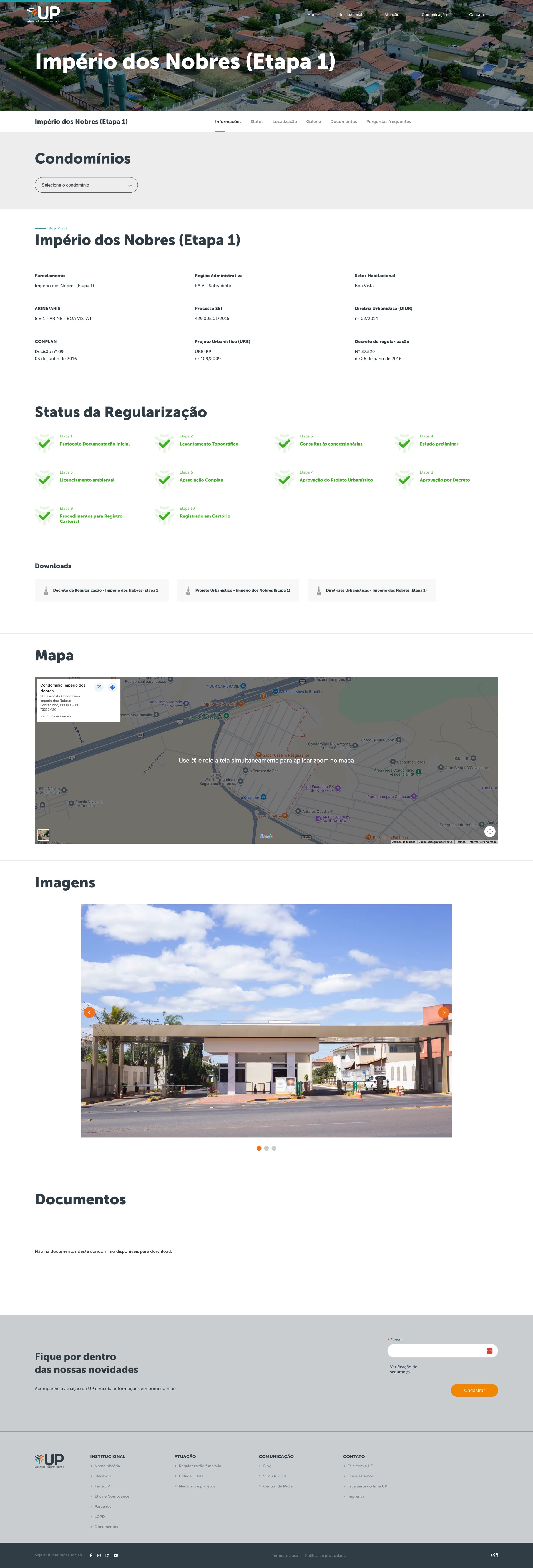
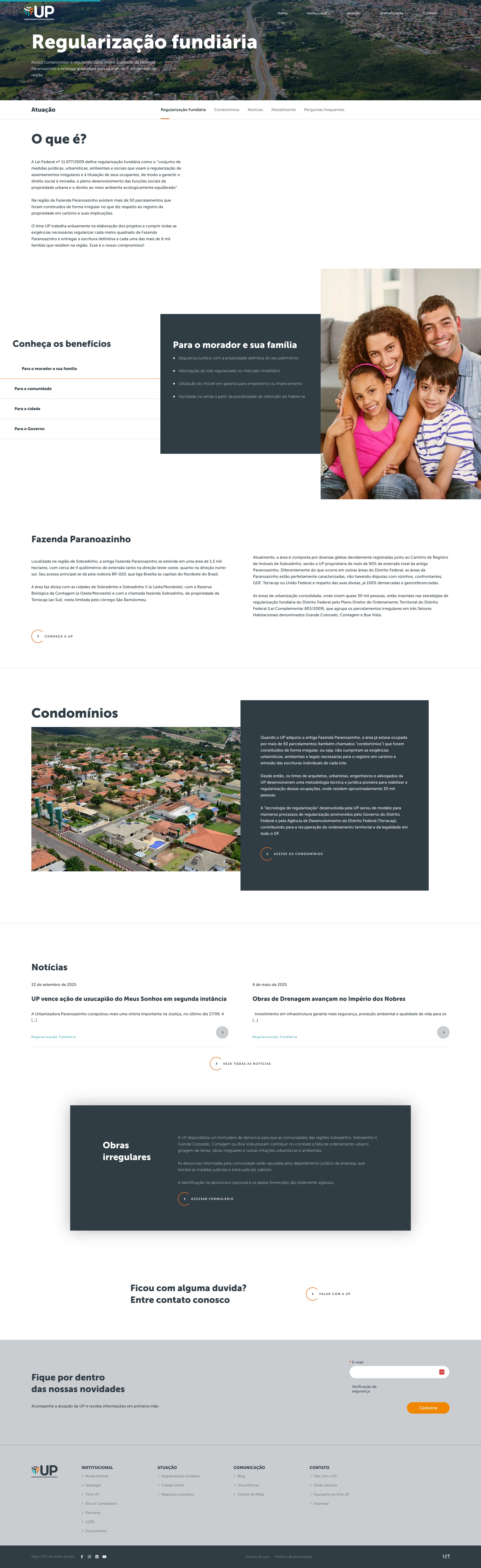
UP – Urbanizadora Paranoazinho works at an unglamorous intersection: real-estate development, environmental law, and decades-old informal settlements in the Distrito Federal. The job is regularizing 50+ irregular condomínios across the former Fazenda Paranoazinho so 6,000+ families can hold definitive title to their homes. It's slow, technical, and fought in court. The category default is opaque legalese and stock-photo institutional sites that hide what the company actually does.
Approach
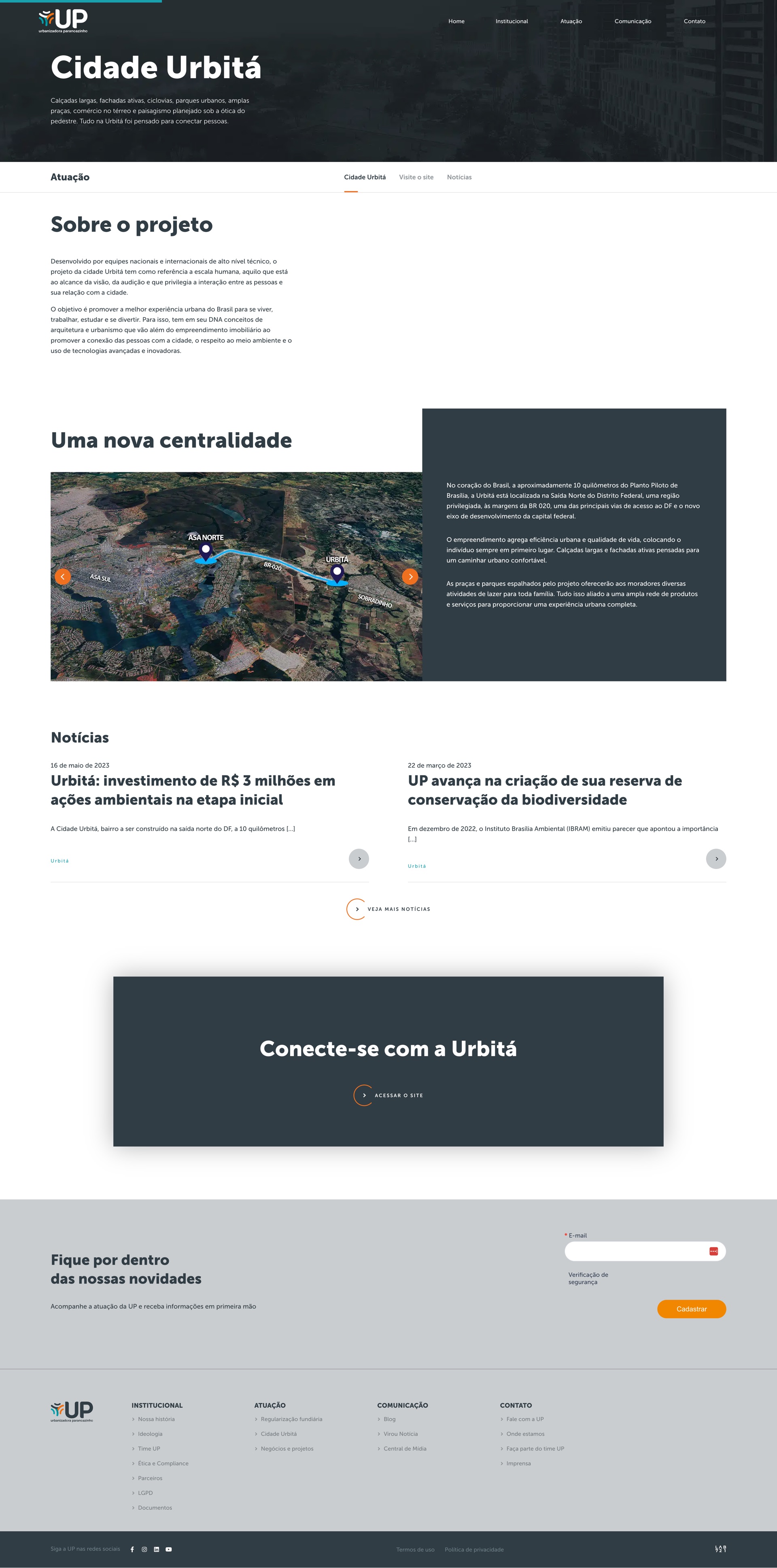
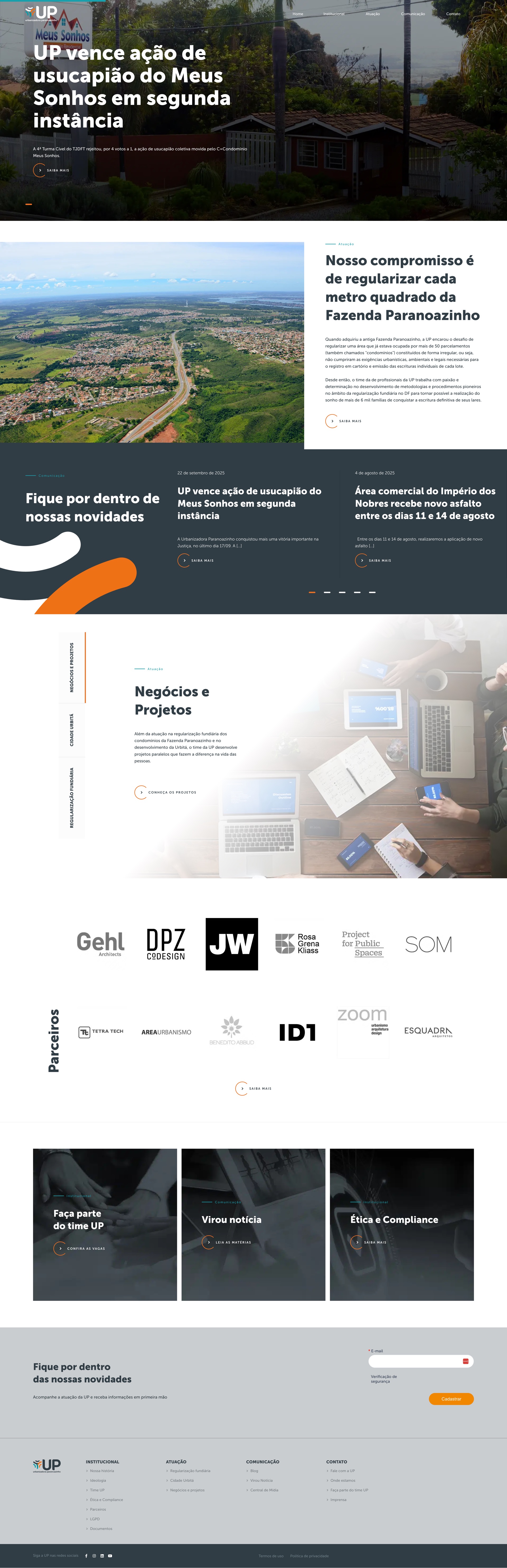
So I designed the site as a newsroom. That fits a company that lives in the press and the courts. A news-led hero puts the latest decision at eye level instead of a generic value proposition. One aerial of the Fazenda Paranoazinho carries the territorial scale that text can't. The partner roster (Gehl, SOM, DPZ CoDesign, Rosa Kliass, PPS) earns the right to talk about Cidade Urbitá without saying "world-class" once. Slate and orange ground a typographic system that lets the heavy institutional content breathe: regularization, ethics, compliance, LGPD. None of it dressed up as a brochure.
Outcome
The site was built in WordPress, and it's been live at up.bsb.br since 2021. It's been UP's main channel for legal wins, infrastructure updates, and the Cidade Urbitá story ever since. The institutional content carries the same calm authority as the news, and the partner page does the legitimacy work without a single hype word.
What I learned
- When the work is slow and legal, the newsroom is the brand. The hero is a news headline, not a value proposition, because that's what people come here to find.
- Some proof points don't need adjectives. A partner page with Gehl, SOM, and DPZ does more than any "world-class" sentence ever could.
Design only: the brand and institutional system in Figma, built in WordPress. The orange swoosh is the one gestural mark in an otherwise photographic, typographic identity, borrowed from the UP wordmark itself. The bit of motion in a system that otherwise stands still.
The system
The system behind the newsroom. Slate and orange ground a single typeface, Museo Sans, so heavy institutional content (regularization, ethics, compliance) reads with calm authority instead of legalese.
Typography
Cidade Urbitá
Museo Sans
Display and headings
Black, 900
Regularização fundiária
Museo Sans
Body and UI
Regular, 400
Palette
Slate
#303d44
Ink and dark ground
Orange
#ef7120
Accent and swoosh
Teal
#18a0ac
Links and secondary accent
White
#ffffff
Surface and reversed text
Light gray
#eceff1
Section surface
Gray
#6c7d86
Secondary text