Neomot
Smart-building tech that finally looks the part. A brand and product site for an elevator maker in the Serra Gaúcha, home to the first elevator in Brazil that works with Alexa.
Role
Year
Status
Stack
Problem
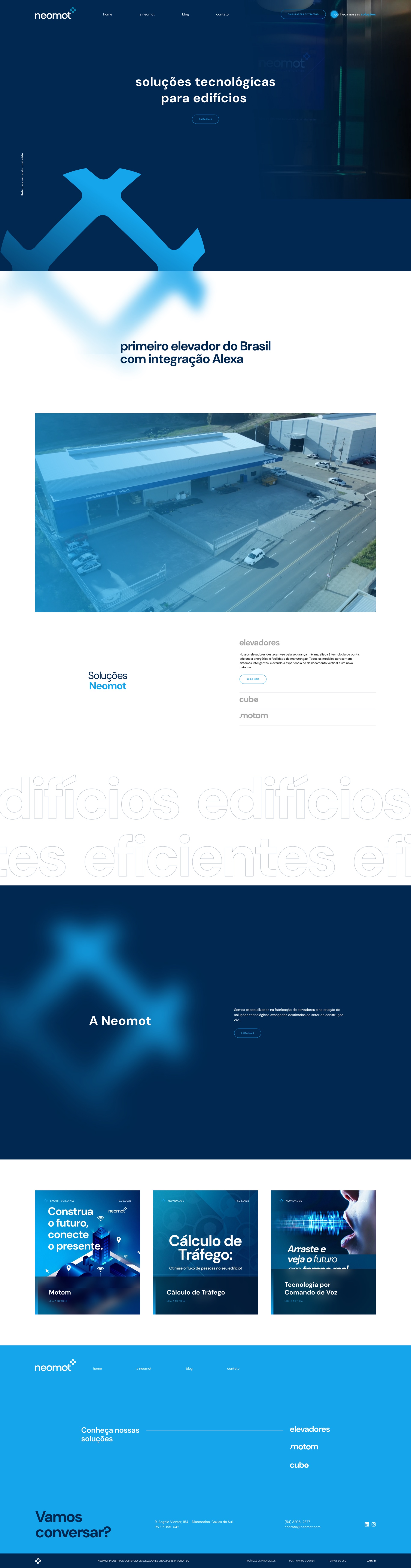
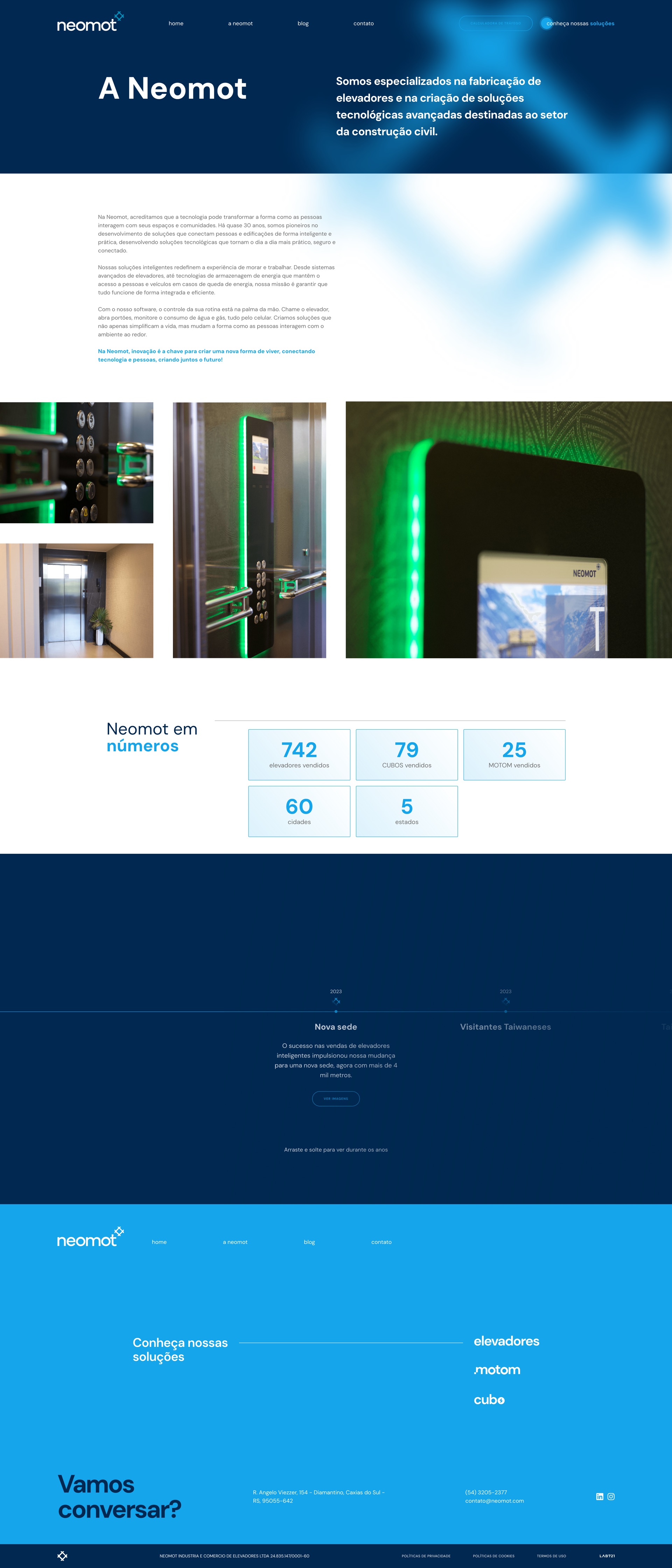
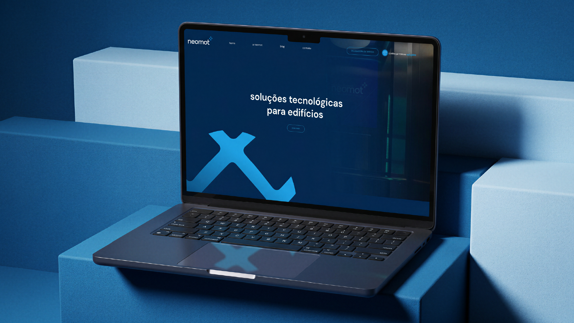
Neomot builds elevators and building technology in Caxias do Sul, including the first elevator in Brazil that works with Alexa. The trouble is the category. Sites in this space all look the same: spec sheets, stock photos, a pile of PDFs. Nothing about that says "technology company," and nothing sets the Alexa elevator apart from any other lift.
Approach
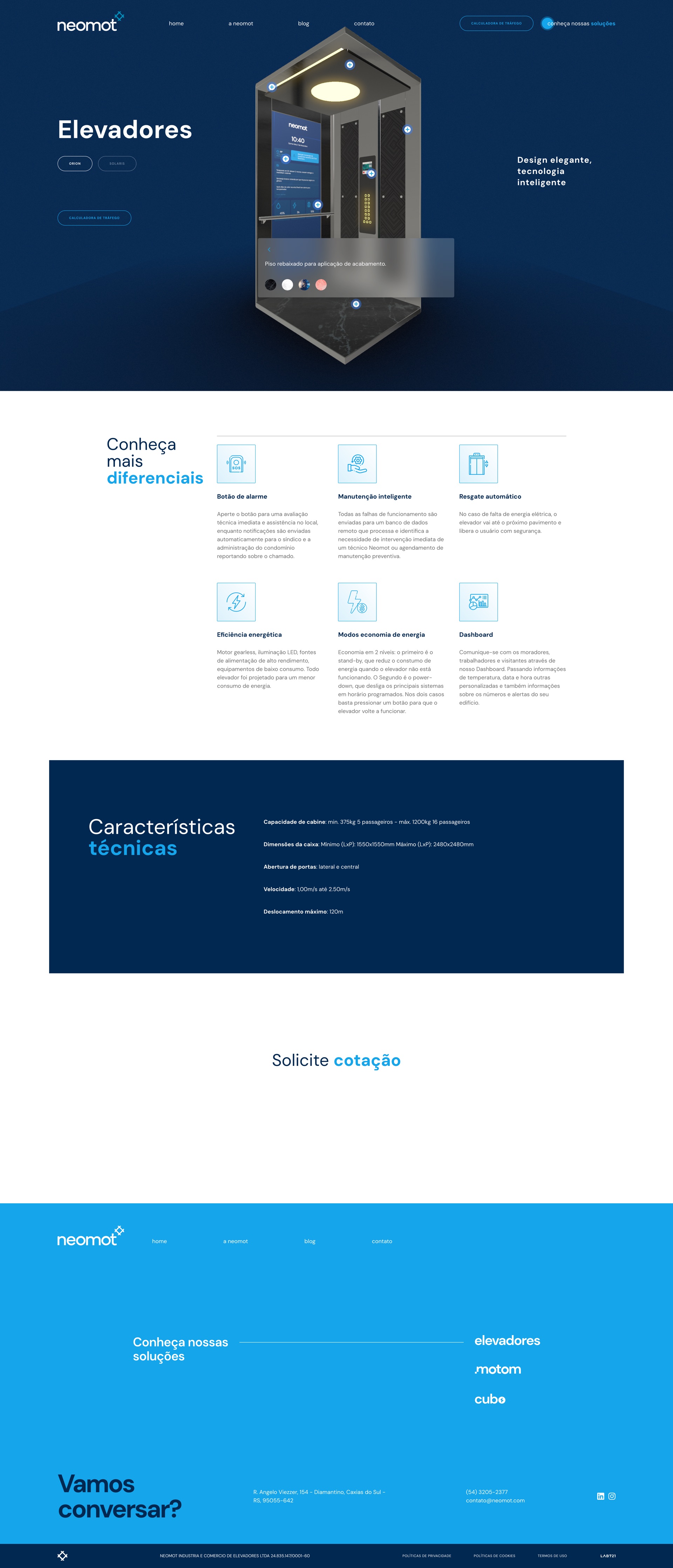
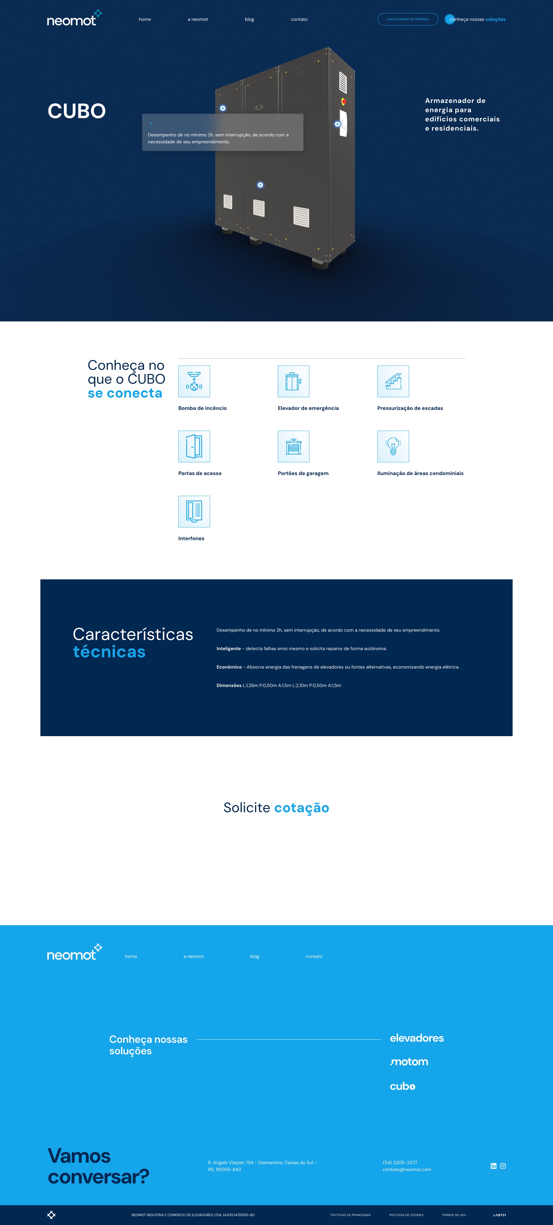
So I designed the site like a product, not a catalog. Deep blue, a shot of electric cyan, a confident sans, and one line to hold it together: soluções tecnológicas para edifícios. That puts Neomot where it belongs, a technology company that happens to make elevators. The three lines (Elevadores, Motom, Cubo) speak the same visual language, so the range reads as one platform instead of three products. The Alexa elevator leads as the proof, not a footnote in a feature list. The products are built in OpenGL, giving the visitor a real view of each one: on the elevator page you can change the wallpaper, the flooring, and the ceiling cutout and see the result on the spot, all to bring more immersion and fidelity to the final product. Motion is there to make the building feel alive, not to show off.
Outcome
It was built in Next.js and it's live at neomot.com. Neomot finally reads as what it is, a building-technology company, with the Alexa elevator, the traffic calculator, and the full range under one calm, technical identity.
What I learned
- The category conventions were the real brief. The screens weren't the hard part. Refusing the catalog template the whole sector leans on was.
- A differentiator only counts if the design treats it like one. Putting the Alexa elevator up front, instead of in a feature list, was the call that mattered most.
- Designing for a build partner means designing the system, not just the screens. Handing the build team one coherent language did more than any single comp could.
Design only: the brand and product system in Figma, built in Next.js. The diamond next to the wordmark is the one geometric mark in an otherwise typographic identity, a quiet nod to the elevator car, and to a company whose whole job is moving things up.
The system
The system I built for Neomot. A deep navy ground, one shot of electric cyan, and DM Sans carrying everything from the headline to the spec sheet. A technology company that happens to make elevators.
Typography
A Neomot
DM Sans
Display and headings
Bold, 700
Soluções tecnológicas
DM Sans
Body, UI and specs
Regular, 400
Palette
Deep navy
#002850
Ground and primary
Electric cyan
#14a5eb
Accent
White
#ffffff
Surface and reversed text
Ink
#000000
Body text
Light slate
#f1f5f9
Light surface