LeadEdu
An immersive site for a leadership-development company. Dark, motion-led, built so an intangible product, how people learn to lead, reads as something premium and concrete from the first scroll.
Role
Year
Status
Stack
Problem
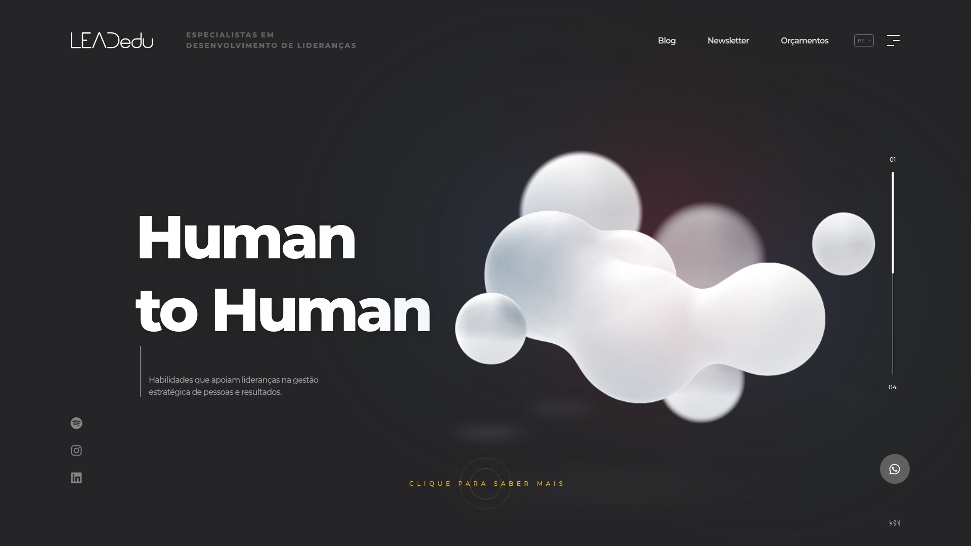
LeadEdu develops leaders: talks, team building, and long-form programs that reskill and upskill people in line with a company's strategy. The product is intangible. You can't photograph leadership development, and the HR and T&D buyers choosing it usually get it as a methodology slide and a price. The brief was to make that intangible feel like an experience worth investing in, without leaning on stock photos of people in meetings.
Approach
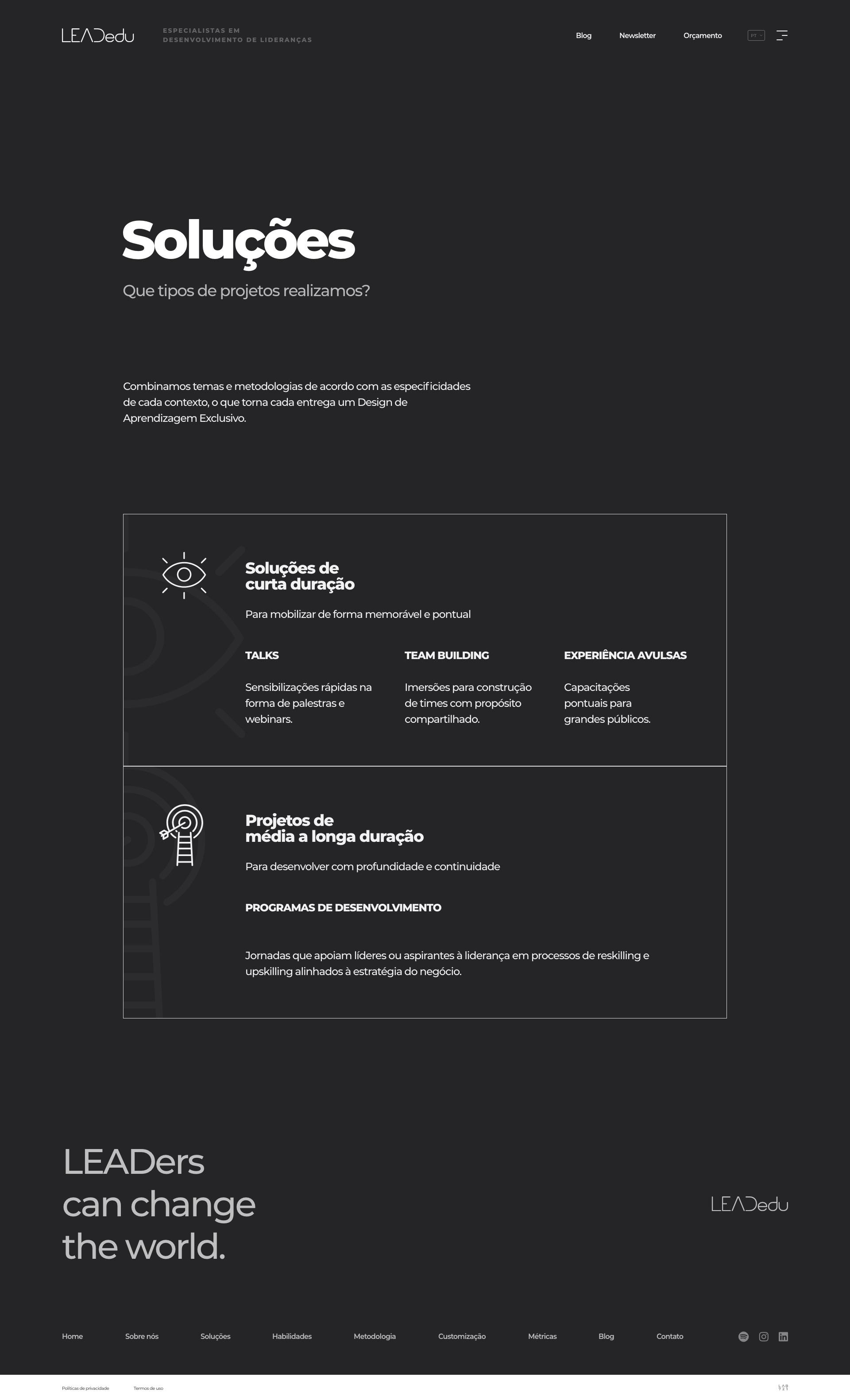
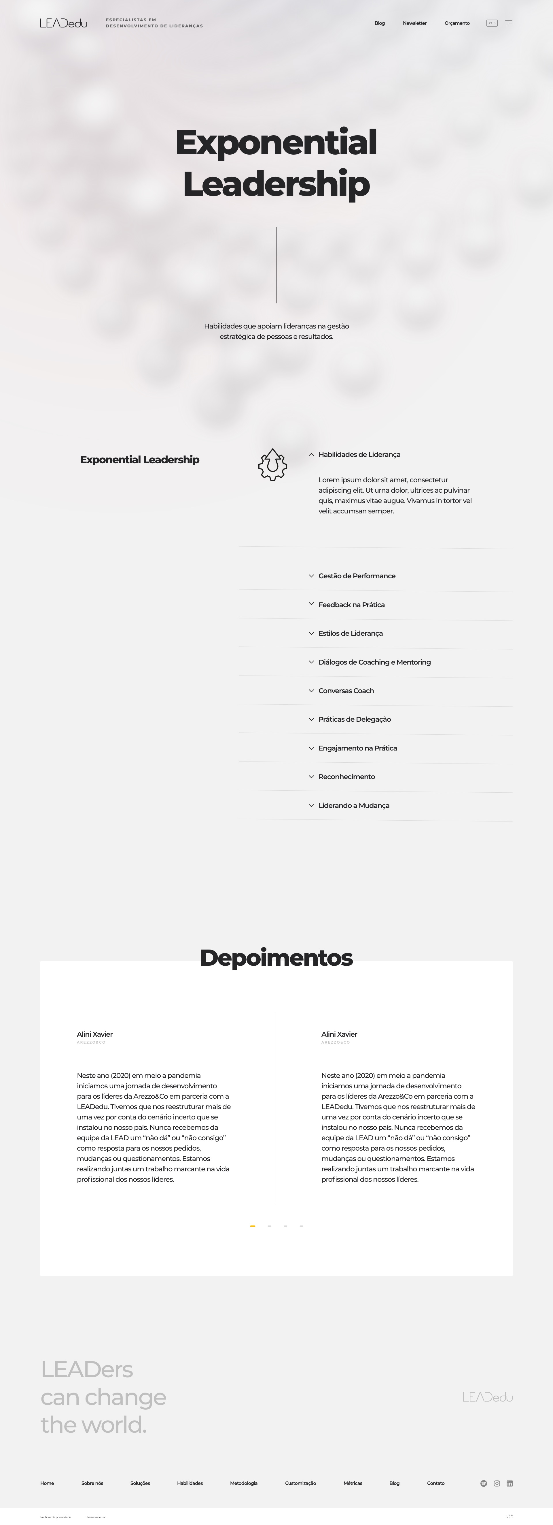
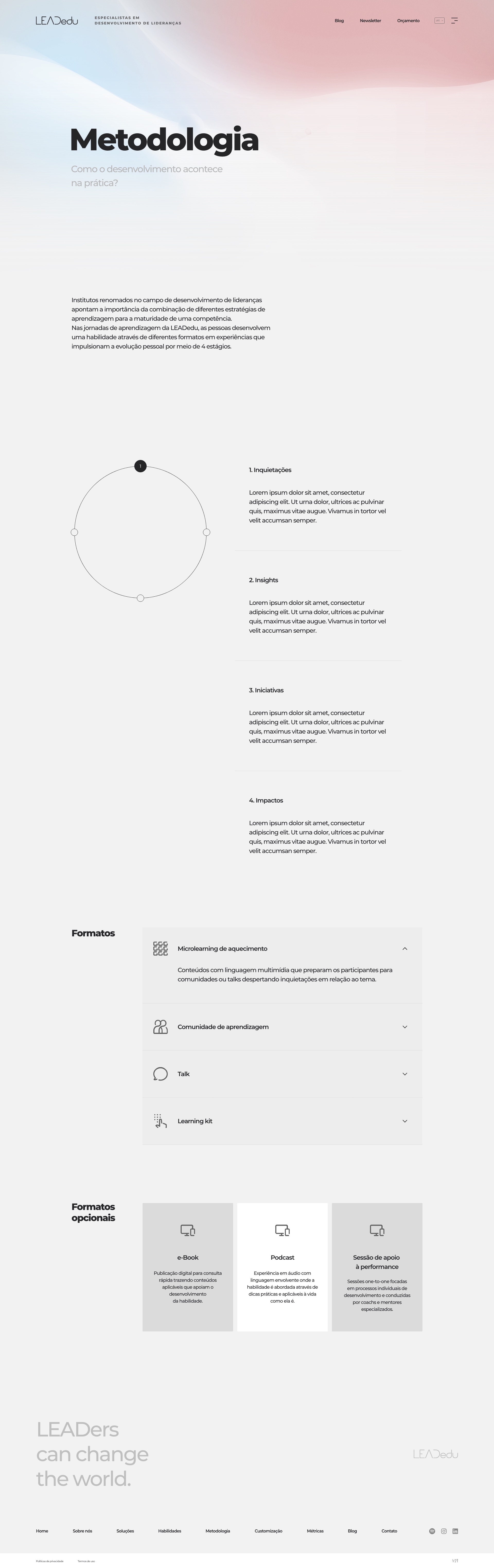
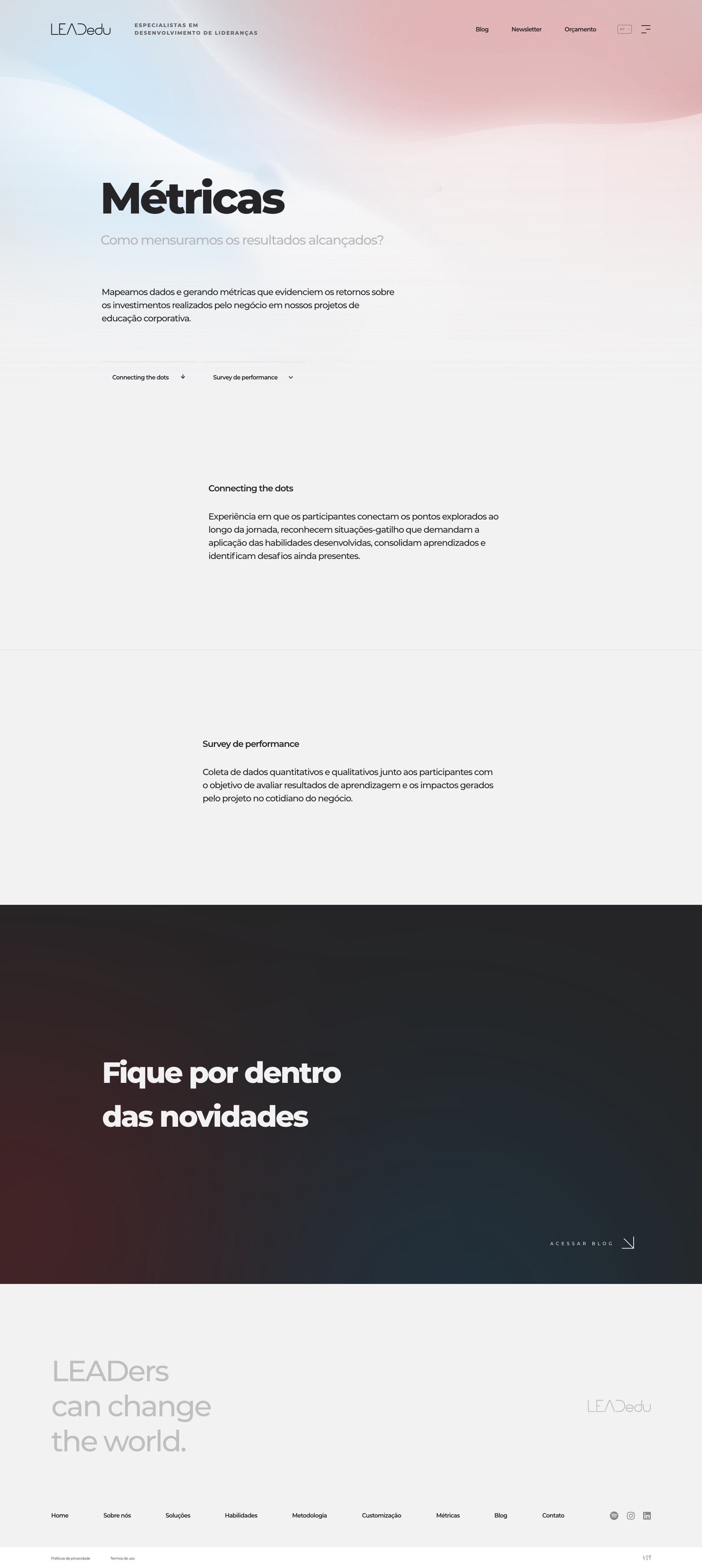
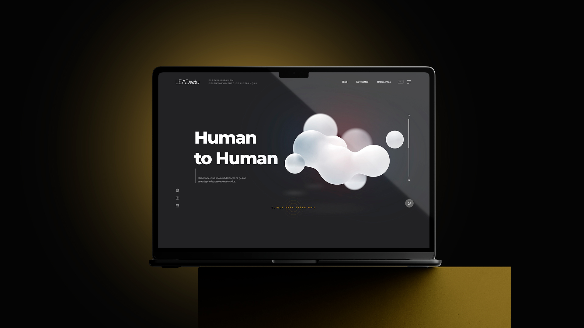
So I built the site around motion and depth instead of a course list. The hero opens on a dark field with a slow 3D form, under one line of positioning: Exponential Leadership, Human to Human, LEADers can change the world. From there the structure follows how a buyer actually evaluates this. Soluções separates the short formats from the long programs. Metodologia turns the method into a clear four-phase shape. Métricas answers the question every T&D lead asks, how you measure the result. The Exponential Leadership program then reads as the proof, with the skills it builds and testimonials from people who lived it.
Outcome
LeadEdu got a site that feels like the experience it sells. The leadership-development offer reads as premium and concrete, the method and the metrics are legible instead of buried in a deck, and a visitor leaves understanding the value, not just the price. It launched in 2019 as the public face of the company.
What I learned
- When the product is intangible, the design is the proof. Motion and depth did the work that a stock photo of a workshop never could.
- A method is more convincing as a shape than as a paragraph. Turning the four phases into one clear diagram made the whole approach legible at a glance.
- Buyers of corporate learning come for the outcome. Giving Métricas its own space answered the real question before anyone had to ask it.
Design only: the UI/UX in Figma. The hardest part was restraint, keeping the motion in service of the message so an immersive site still reads like a serious one.