Vinícola Arbugeri
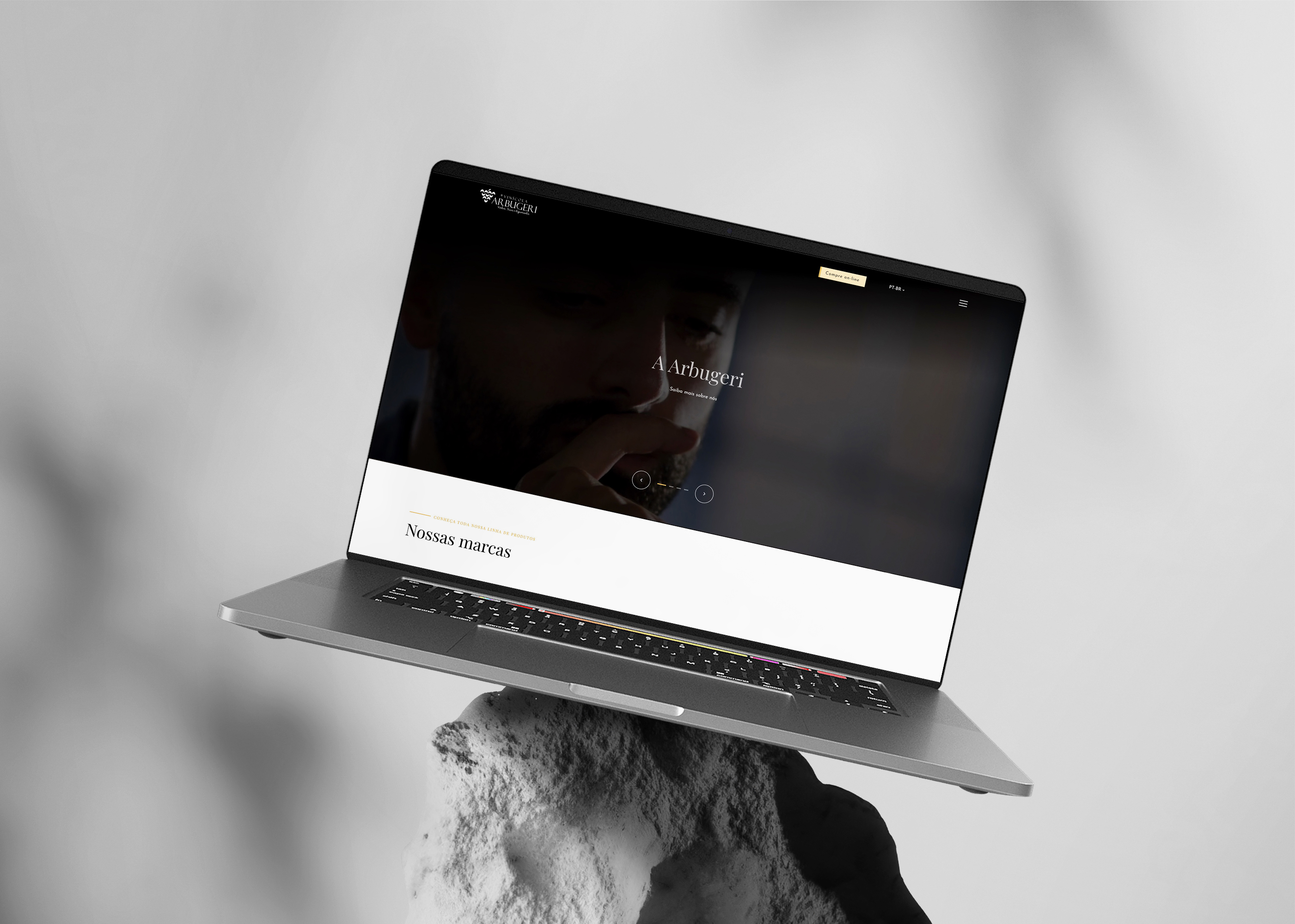
A Serra Gaúcha winery, online. An editorial brand site for a family that has made wine since the 1960s.
Role
Year
Status
Stack
Problem
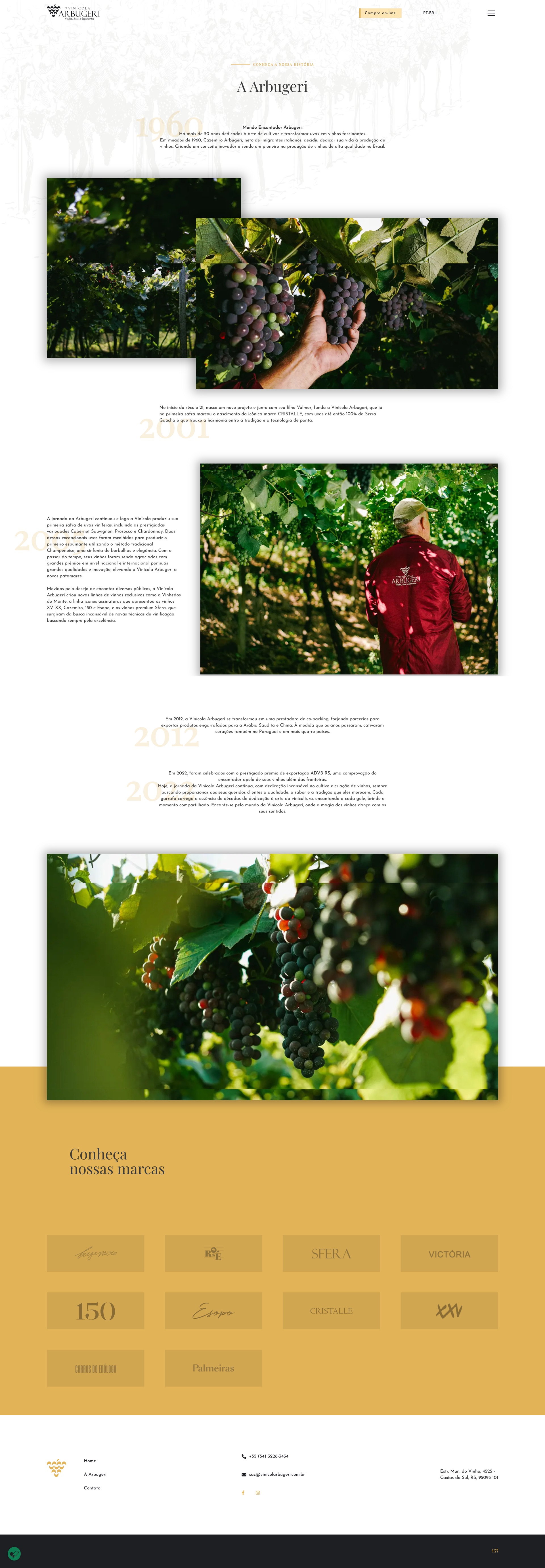
Arbugeri has made wine in Caxias do Sul for more than half a century, starting with Casemiro Arbugeri in the 1960s. The range runs wide: from the flagship Cazemiro to Sfera, Victória, and the espumantes. None of it lived online. The brand needed a site that could carry the weight of the family story and present the full range, without turning into a generic template.
Approach
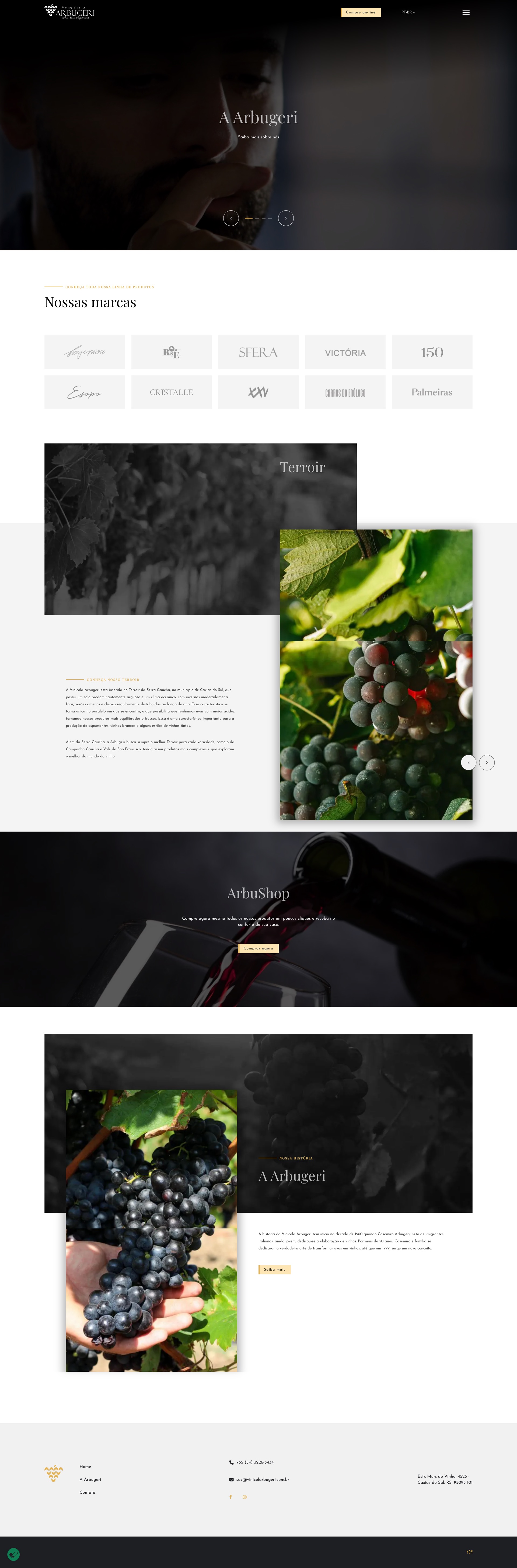
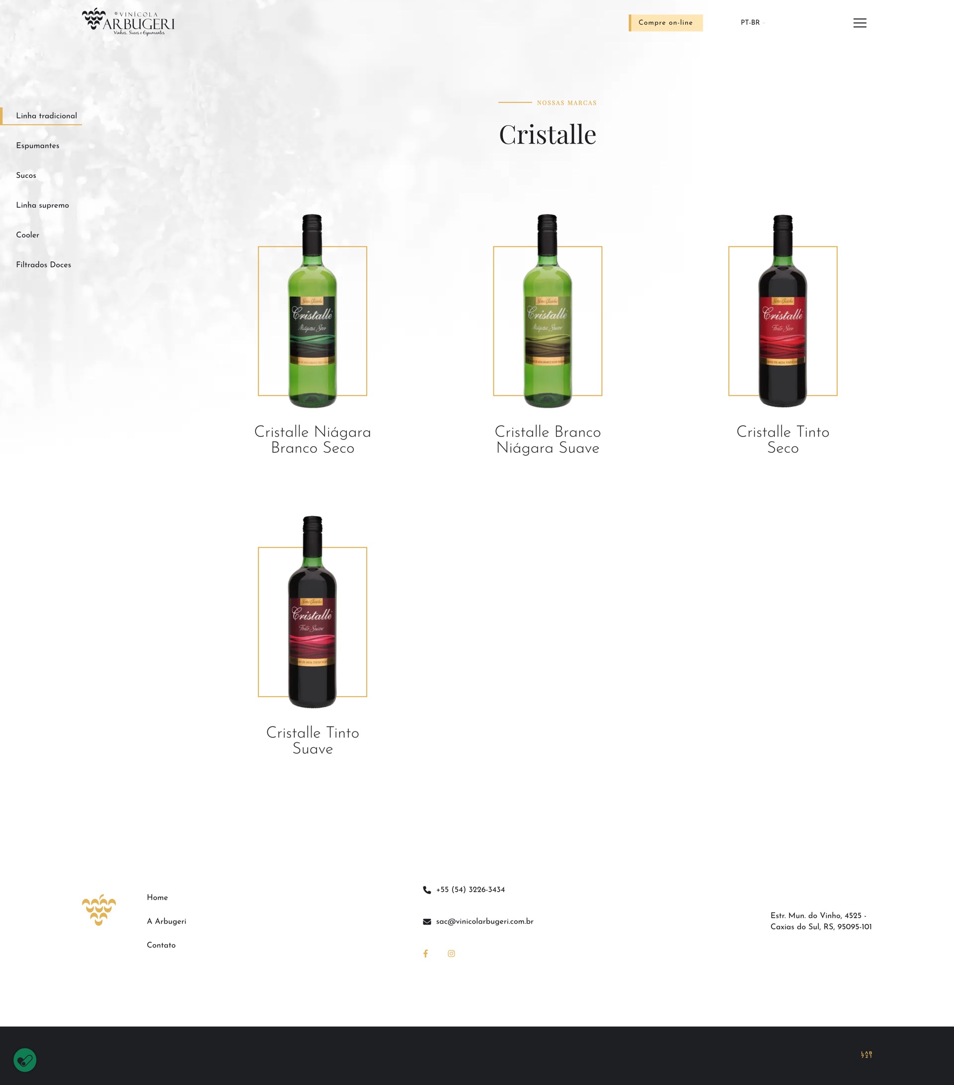
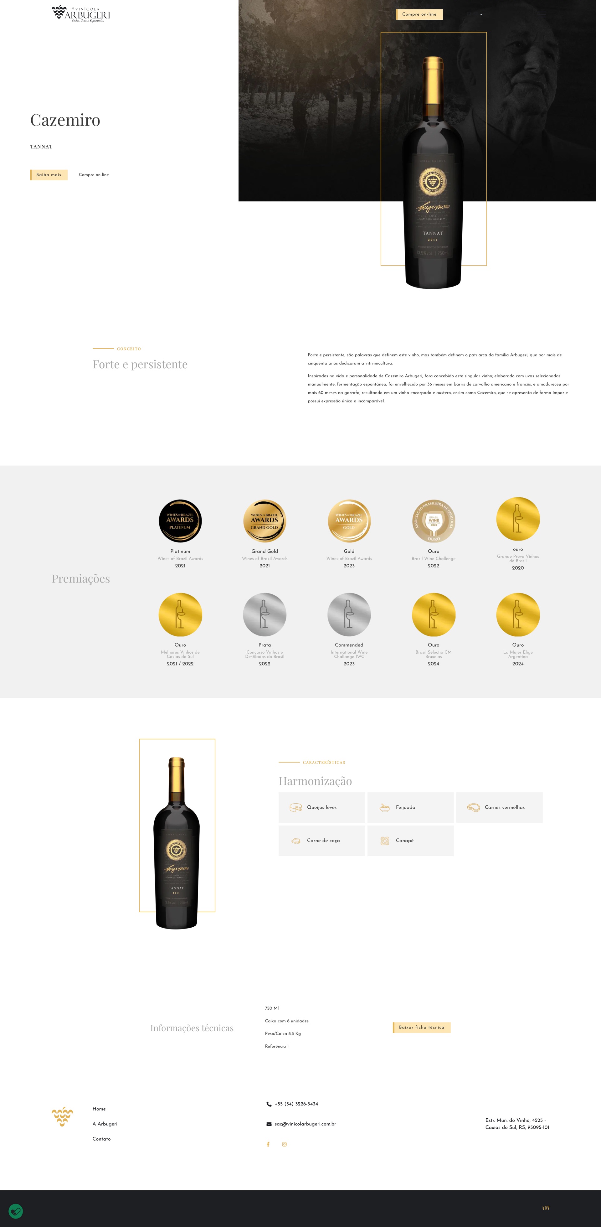
I handled the UI/UX and designed the site layout in Figma; a development partner took it from there and built it. The home opens on terroir and lineage. The catalog treats each label as its own object rather than a grid cell. The product page gives the spec sheet, the awards, and the food pairings room to read without crowding.
Outcome
Vinícola Arbugeri now has one home for its history and its range. The site is live, and the full collection finally reads as one house instead of ten disconnected products.
What I learned
- A winery with ten labels doesn't need ten layouts. One disciplined system that lets each bottle speak beats art-directing every label on its own.
- Carrying sixty years of history without weighing the page down is a job for hierarchy. The hardest edit was choosing what to leave out so the rest could breathe.
The system
The visual system I set for the brand. Dark, cinematic photography carrying a single warm gold, a thin serif for the lyric, and a geometric sans doing the quiet work of navigation and copy.
Typography
A Arbugeri
Playfair Display
Display and headings
Serif, set light and airy
Vinhos, sucos e espumantes
Josefin Sans
Body, navigation and UI
Geometric sans, regular
Palette
Gold
#e2b457
Accent
Gold tint
#fee6b4
Soft fills
Charcoal
#1d1f23
Ink and dark ground
White
#ffffff
Surface and reversed text
Light gray
#f4f4f4
Section surface
Body gray
#3b3b3b
Secondary text