Design systemMay 1, 2026
Heurix: a design system with one product in mind
A from-scratch React design system whose component list gives away what it was built for. Heurix isn't a neutral kit: its tokens, theme model, and organisms were shaped to dress one specific product, then published to npm.
Brief
Build a real, publishable React design system from zero: tokens, theming, components, docs. Coherent enough to dress a whole product without reaching for a UI kit, and finished enough to ship to npm.
Initial idea
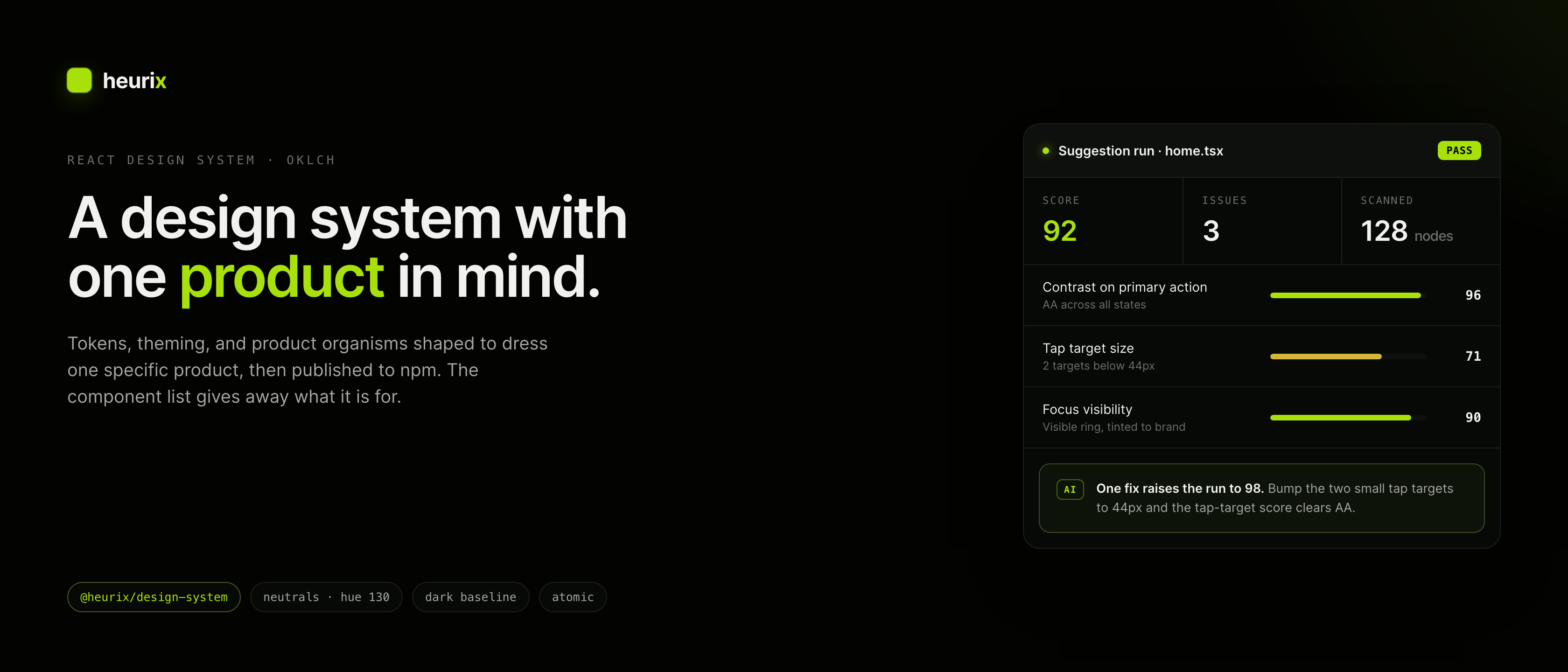
Most systems start generic and get bent toward a product later. I wanted the opposite: let the product's vocabulary shape the system from the first commit. A kit with a ScanBar, an EvalRow, and an AIBlock isn't pretending to be neutral. It knows what it's for, and that honesty is the feature.
Decisions
- 01Neutrals are one hue moved only by lightness: --bg oklch(0.10 0.008 130), --surface oklch(0.13 0.008 130), --fg oklch(0.96 0.005 130). Same hue (130), near-zero chroma, so dark and light read as one idea at two exposures instead of two palettes hand-matched to look related.
- 02Dark is the baseline, not a mode bolted on. :root and [data-theme="dark"] carry it; [data-theme="light"] is the override.
- 03Exactly two border tokens: --border and --border-strong. No alpha-tweaked one-offs. Same deletion discipline that keeps a dark theme from drifting.
- 04One vivid accent, deliberately a flat hex: --accent #a8e009. The neutrals earn OKLCH's perceptual math; the accent just needs to be itself.
- 05Atomic design is the file system, not a slide. Atoms, molecules, organisms, each gets its own folder behind a flat barrel export.
- 06Product organisms (EvalRow, SuggestionCard, AIBlock, SuggestionRunHeader, StatsTile) live in the system, not the app. The app composes them; it never restyles them.
- 07Two docs surfaces on purpose: a Vite showcase for the real composed product feel, and Storybook 8 for component-by-component states.
- 08No CSS-in-JS runtime: custom properties for tokens, CSS Modules for components, and a tiny cx() helper for class merging. Strict TypeScript and Vitest hold the edges.
Conclusion
A system scoped to one product ends up more honest and more reusable than a generic kit. The hard calls (what an EvalRow is, what an AIBadge means) get made once, in the system, where they belong. The OKLCH neutral ramp is the part I'd reach for again first: pick a hue, move only lightness, and the theme simply doesn't drift.
The tell is in the organism list. A neutral kit ships `Card` and `List`; Heurix ships `EvalRow`, `SuggestionCard`, and `AIBlock`. Those names are a product leaking into its design system on purpose. That's the whole point. The system isn't trying to be everything; it's trying to be one thing well, and to be honest about which thing.
The OKLCH neutrals are the quiet hero. Anchoring `--bg`, `--surface`, and `--fg` to a single hue at near-zero chroma and moving only lightness means dark and light are the same idea at two exposures, not two palettes nudged until they look like relatives. That's the difference between a theme that holds for six months and one that drifts by the third new screen. It's also why the only saturated decision in the whole file, the lime `--accent`, gets to be a plain hex.
Live components
The real @heurix/design-system components, running right here on the page. Toggle the theme, pick heuristics, run a scan.